
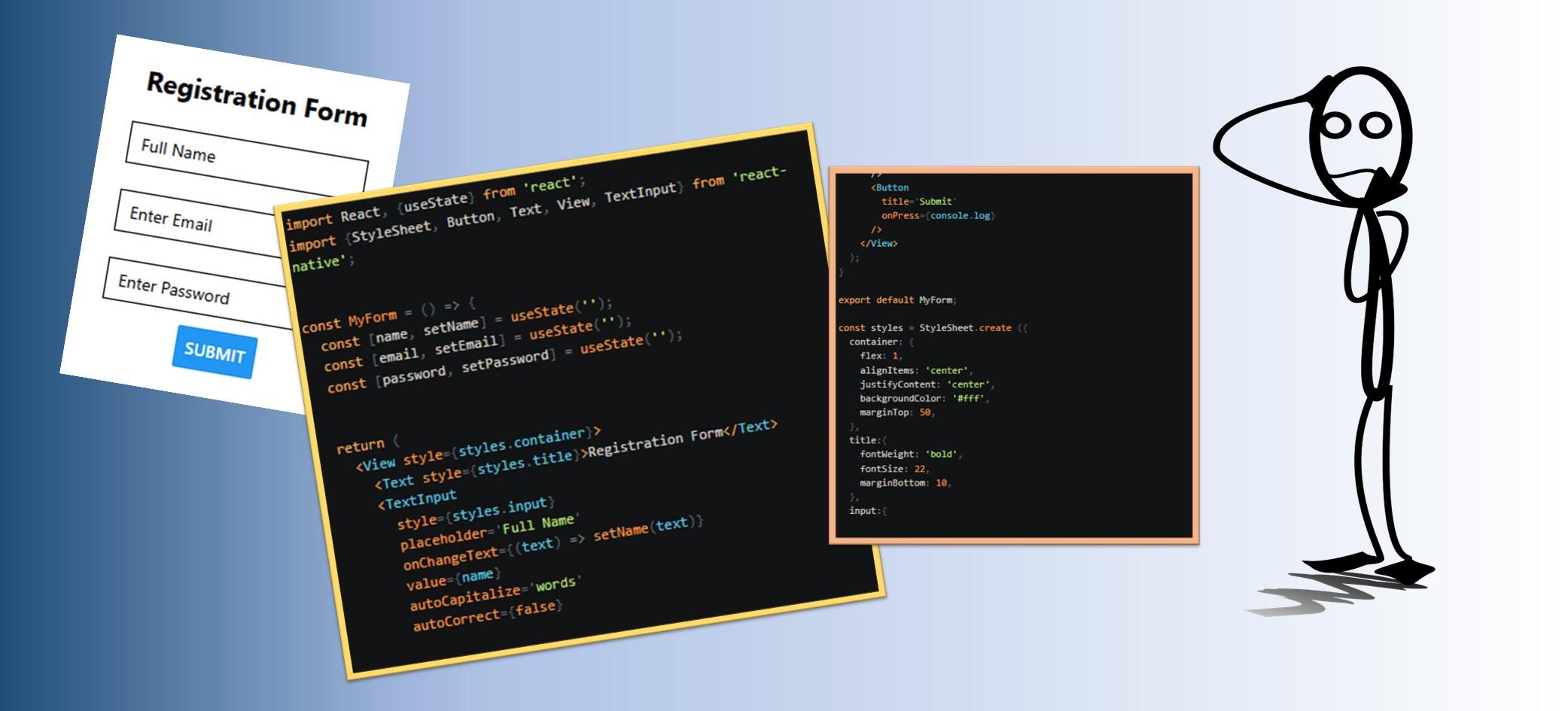
In this write-up, we will explore two textInput customizations for each field (name, email and password).
We considered how to handle validation errors in a previous article.
Let us start with the name field.
1. Name Field Customization
#autoCapitalize
This is an enum-type customization that instructs textInput to automatically capitalize specified characters. To auto-capitalize:
- all characters, set autoCapitalize=‘characters’,
- the first letter of each word, set autoCapitalize=‘words’,
- the first letter of each sentence, set autoCapitalize=‘sentences’ (this is the default setting for react native)
- and none of the input, set autoCapitalize=‘none’.
In this example, we will set autoCapitalize=’words’ in the name field, because we want the first letter of each name to be capitalized.
					      <TextInput
        style={styles.input}
        placeholder='Full Name'
        onChangeText={(text) => setName(text)}
        value={name}
        autoCapitalize='words'
      />
Note that this property is not supported by some keyboard types such as name-phone-pad.
#autoCorrect
This is a Boolean type customization that enables or disables auto-correct. By default value, react native enables auto-correct.
In this example, we will set autoCorrect={false} to disable auto-correct for the name field.
					      <TextInput
        style={styles.input}
        placeholder='Full Name'
        onChangeText={(text) => setName(text)}
        value={name}
        autoCorrect={false}
      />
2. Email Field Customization
#autoComplete
This enum-type customization gives the system autocomplete hints so it can provide autofill. To disable autocomplete, set =’off’. We can set autoComplete using alot of values like: additional-name, country, current-password, email etc.
In this example, we will set autoCompleteType=’email‘
					      <TextInput
        style={styles.input}
        placeholder ='Enter Email'
        onChangeText={text => setEmail(text)}
        value={email}
        autoCompleteType="email"
      />
#keyboardType
This is an enum-type customization that determines which keyboard would be opened. The following values work across platforms: default, number-pad, decimal-pad, numeric, email-address, phone-pad and url.
In this example, we will set keyboardType=’email-address‘ because the user would enter an email address.
					      <TextInput
        style={styles.input}
        placeholder ='Enter Email'
        onChangeText={text => setEmail(text)}
        value={email}
        keyboardType='email-address'
      />
3. Password Field Customization
#secureTextEntry
This is a boolean type customization that obscures the text input if it is set to ‘true’. It is used for sensitive text like passwords. The default value is false.
In this example, we will set secureTextEntry={true} because we would like the password to be obscure.
					      <TextInput
        style={styles.input}
        placeholder ='Enter Password'
        onChangeText={text => setPassword(text)}
        value={password}
        secureTextEntry={true}
      />
#autoComplete
We will also set autoCompleteType=’password’ for the password field.
					      <TextInput
        style={styles.input}
        placeholder ='Enter Password'
        onChangeText={text => setPassword(text)}
        value={password}
        secureTextEntry={true}
        autoCompleteType='password'
      />
These are just a few customizations for our form field. You can apply other customizations like allowFontScaling, autoFocus, blurOnSubmit, maxLength etc.
Kindly find the complete example code.
Use the Expo Go app to run and test your code in real time.
Code Example: How to Customize Text Input in Form Fields (complete code)